Mar 1, 2024
Accelerating & Scaling Energy Efficiency
Reimagining an energy audit platform that scales impact for both business and community.
Gemini Energy Solutions (Gemini), an energy audit and clean-tech company, provides affordable, investment-grade audits for small commercial buildings through their SaaS platform, Conserve. I led a product and UX redesign to prepare the platform for scale, improve the accuracy and speed of data collection, meet accessibility standards, and give users clearer ways to see and act on the impact of their work.
Role
Lead Product & UX Designer
Company
Industry
Clean energy / Climate tech
Team
Nicole Dery – Project Lead
Samantha Hawkins – Design Lead
Cara Reiner – UX Researcher
Responsibilities
UX Design
Heuristics Evaluation
User Research
Design System
Tools
Figma
FigJam
Loom
Problem
Conserve was powerful but difficult to use, especially for new auditors. People felt overwhelmed, got lost inside audits, and struggled to complete complex tasks without help. This led to a high turnover rate among subcontracted auditors and a heavy, ongoing support burden for the Gemini team.
Goal
The primary goal of this project was to make Conserve feel clear, approachable, and dependable for anyone using it. The redesign focused on giving auditors confidence, simplifying first-time use and navigation, and better supporting complex tasks so the product could scale without constant hand-holding.

Discovery
As a team, we started with a focused discovery phase: interviewing stakeholders (investors and the Gemini team), reviewing customer feedback, and researching the energy audit domain to understand both user and business needs. From there, I audited the existing Conserve app using heuristic and accessibility reviews, end-to-end task walkthroughs, and responsive checks across key screens, mapping pain points and opportunities that would guide the next phase of work.
From this foundation, we mapped key user personas and their end-to-end journeys. We clarified who uses Conserve, what they need to accomplish, and where they get stuck, which helped us define their specific needs, success criteria, and the moments in the flow where design changes would have the most impact.
Guiding Question
“What makes Conserve hard to use during an energy audit, especially for new users?”

Findings
From this discovery work, four core UX problems surfaced. These themes shaped where to simplify the experience, improve wayfinding, reduce effort, and add better feedback across the product.
Core Themes:
Task Clarity and Priorities
Core tasks like starting or continuing an audit were buried in dense layouts. This showed a need for clearer hierarchy and grouping so the next action is always obvious.Orientation and Navigation
People often did not know where they were in the audit or how they got there. This pointed to an update to the site architecture as well as clearer labels, breadcrumbs, and visual cues to keep users grounded in the audit flow.Data Entry Effort and Efficiency
Screens showed more than 100 fields and relied on repetitive manual entry. This called for simpler forms, smarter defaults, and shortcuts to reduce effort and speed up work.Feedback and User Guidance
Users lacked a clear sense of progress or how to complete something. This highlighted the need for visible progress indicators, checklists, and inline guidance on complex steps.

Solution
To address these UX themes and issues, we redesigned Conserve into a clearer, end-to-end audit experience with the focus of this work being across mobile. The updated flows focus on surfacing the right task at the right time with cleaner navigation, simpler data entry, and clearer progress so users can move through audits with more confidence and less effort.
Overarching Improvements:
First Impressions
Created a thoughtful login and entry experience that establishes trust, reflects the updated brand, and sets expectations for a more polished product.Streamlined Tasks
Introduced centralized audit and task management with clearer workflows so users can see what is in progress, what is blocked, and what comes next.Optimized Mobile
Refined the mobile interface with focused navigation, relevant notifications, and clearer structure so data collection on the go feels intentional rather than improvised.Progress Tracking
Added real-time status updates and structured input patterns to give users immediate feedback on completion, errors, and what still needs attention.
Key Features & Updates
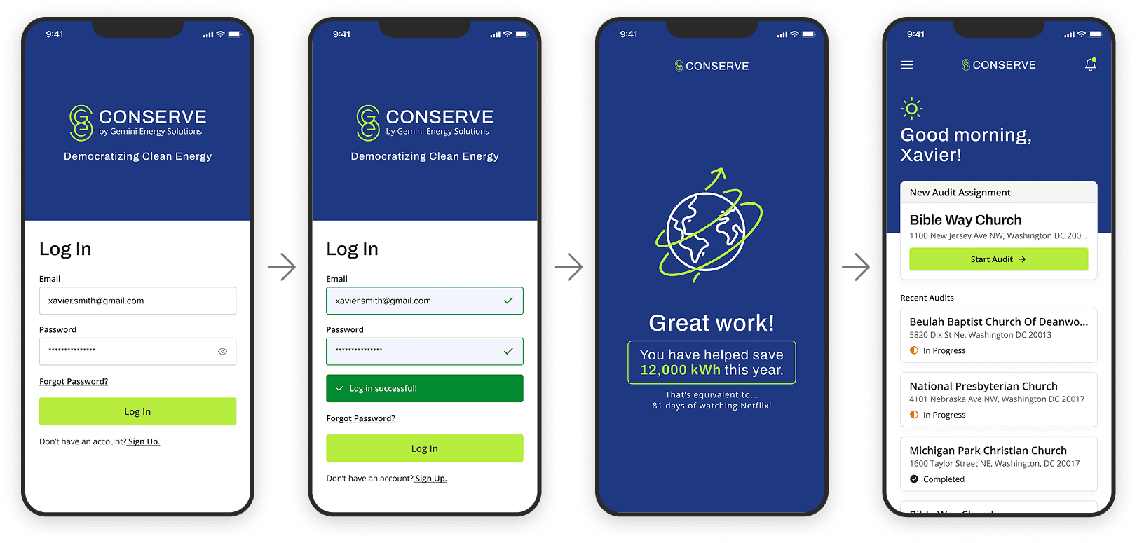
New Login
We reworked the login flow to feel clearer, faster, and more aligned with Conserve’s brand so users start each session oriented and ready to work. A tighter information architecture, clearer inputs, and a smarter home screen turn sign-in into a direct path to active audits.
Details
Updated visuals and micro-interactions help the product feel modern, reliable, and consistent with Gemini’s brand.
Clear input states for required, valid, and error fields reduce confusion and rework at sign-in.
A modular home screen surfaces key actions, recent audits, and important alerts immediately after login.
Visual audit cards present status at a glance so users instantly see progress and what needs attention.
Mobile Site Architecture
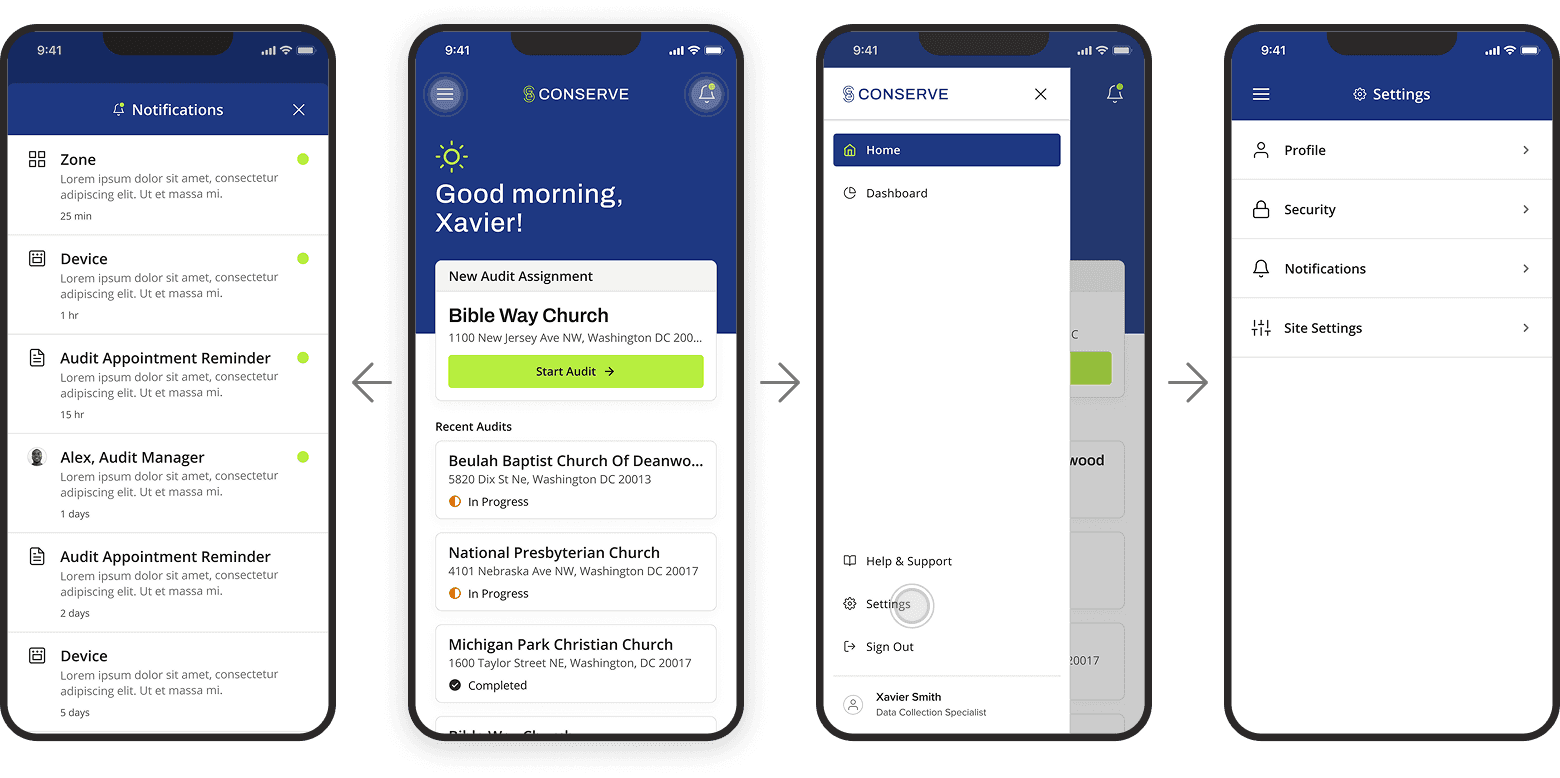
We rethought the mobile site and information architecture to make Conserve feel like a single, cohesive system rather than a collection of disconnected screens. The new framework centers everything around a clearer home experience, with navigation, notifications, and settings all easier to find and use, giving users fast access to their most important work.
Details
Reimagined the site architecture from login and home through individual audits, sub-zones, and tasks.
Redesigned the mobile home page as a simple launchpad for active audits, recent work, and primary actions.
Established clear, consistent navigation patterns so users always know where they are and how to get back home.
Added in-app notifications to surface upcoming work, incomplete audits, and important updates.
Relocated settings and supporting actions to more intuitive, predictable locations, reducing the need to hunt through menus.
Mobile Audit Flow
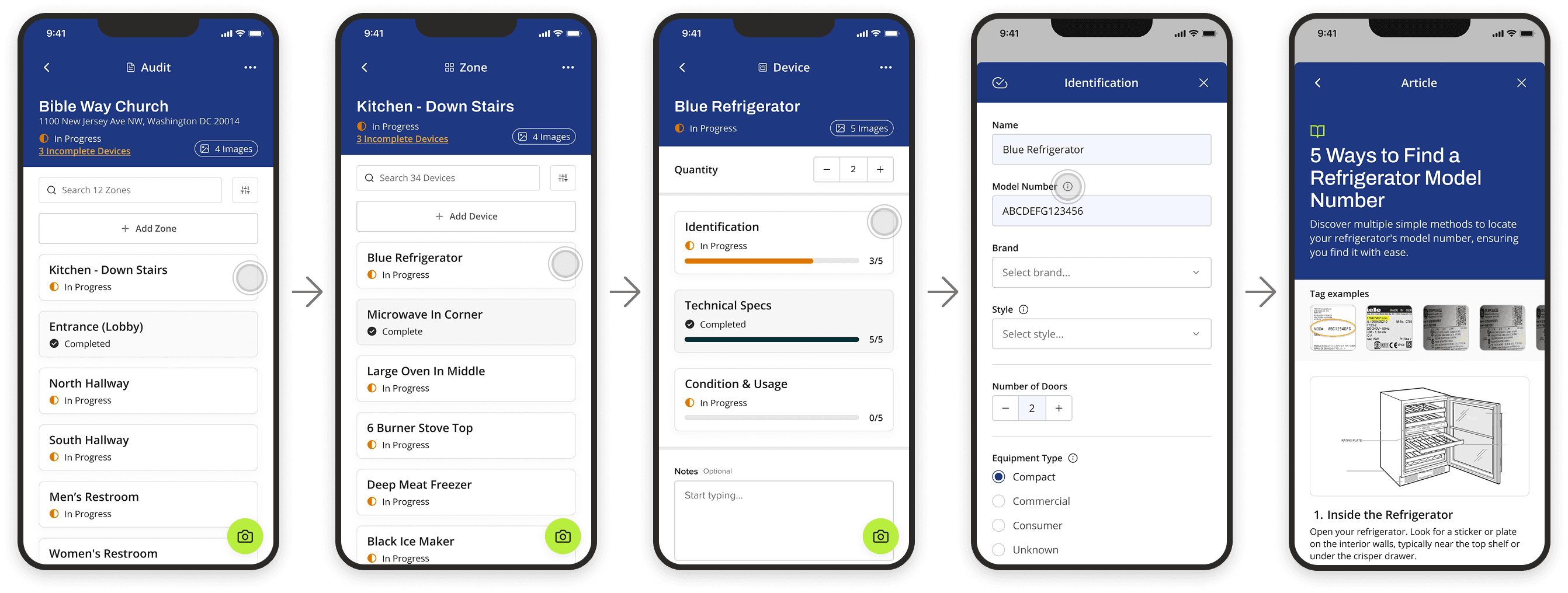
We redesigned the mobile audit flow so auditors can move through audits faster, stay oriented, and capture data with more confidence.
Details
Simplified audit levels (site → zone → device) with clearer labels and progress at each step.
Streamlined navigation between tasks so users can move forward or back without losing their place or context.
Introduced smarter, flexible inputs (dropdowns, toggles, photo capture, barcode scan) that match the type of data being collected.
Added auto-save for in-progress work to prevent data loss during unstable network conditions or context switches in the field.
Included in-context tips and lightweight guidance to clarify what to collect and how to complete each section.
Insights
This project was especially rewarding because of its potential impact. Giving small and mid-sized businesses access to reliable energy audit tools can directly reduce their environmental footprint and benefit the communities they serve.
Key insights
A product can have a clear social or environmental benefit, but if it is hard to use people will not adopt it.
Component libraries and design patterns do not guarantee good UX; value comes from how they are applied to real workflows and constraints.
Clear task framing is as important as visual polish. When users know what to do next, their confidence and speed both improve.
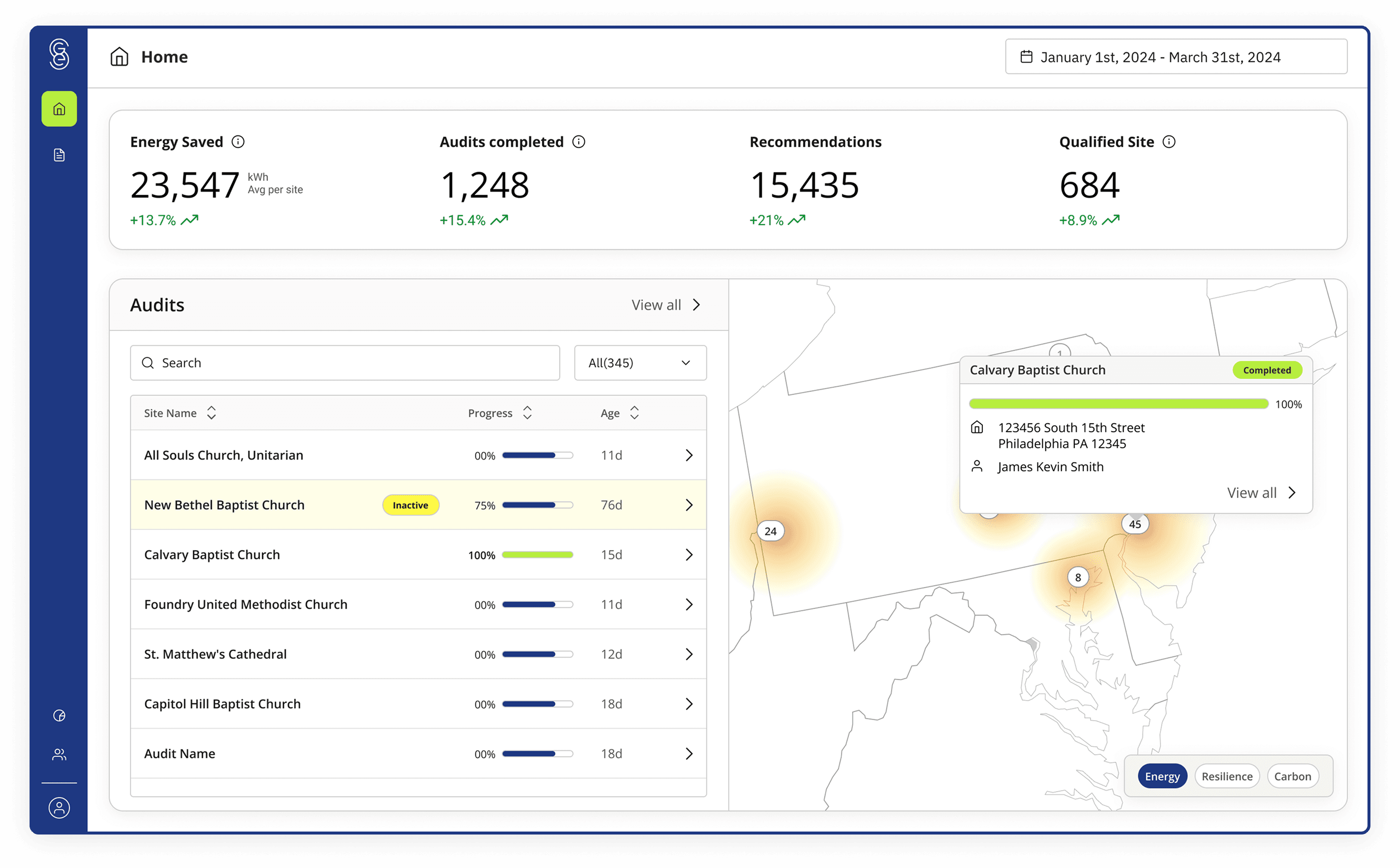
Making impact visible in plain language (energy saved, audits completed, recommendations implemented) keeps both auditors and leadership engaged over time.
Next Steps
This phase focused primarily on the mobile experience, since it is the main tool for auditors in the field. In parallel, we began exploring a dashboard concept to visualize outcomes for executive leaders and investors, helping them understand the value of the product and the services it delivers.
Future work would deepen this direction by refining the impact dashboard, validating it with stakeholders, and building a lightweight design system so the mobile experience, web app, and reporting all feel cohesive, scalable, and easier to extend as Gemini’s business grows.